An apple with a bite taken out of it. A red bullseye. An upwards tick. Even a distinctive red color with the edge of a white script letter. Apple, Target, Nike & Coke. Logos so powerful you know them even if you don’t consume their respective products. Designing a logo for a new or even existing business can be a daunting & sometimes crippling task. As it turns out, you don’t need to possess the visual eye of Pablo Picasso to make a good decision (…in fact it’s probably better if you don’t!). Here’s some of my logo design tests I use to make it easier.
Logo Design Tests
1. Easy to Read & Recognisable
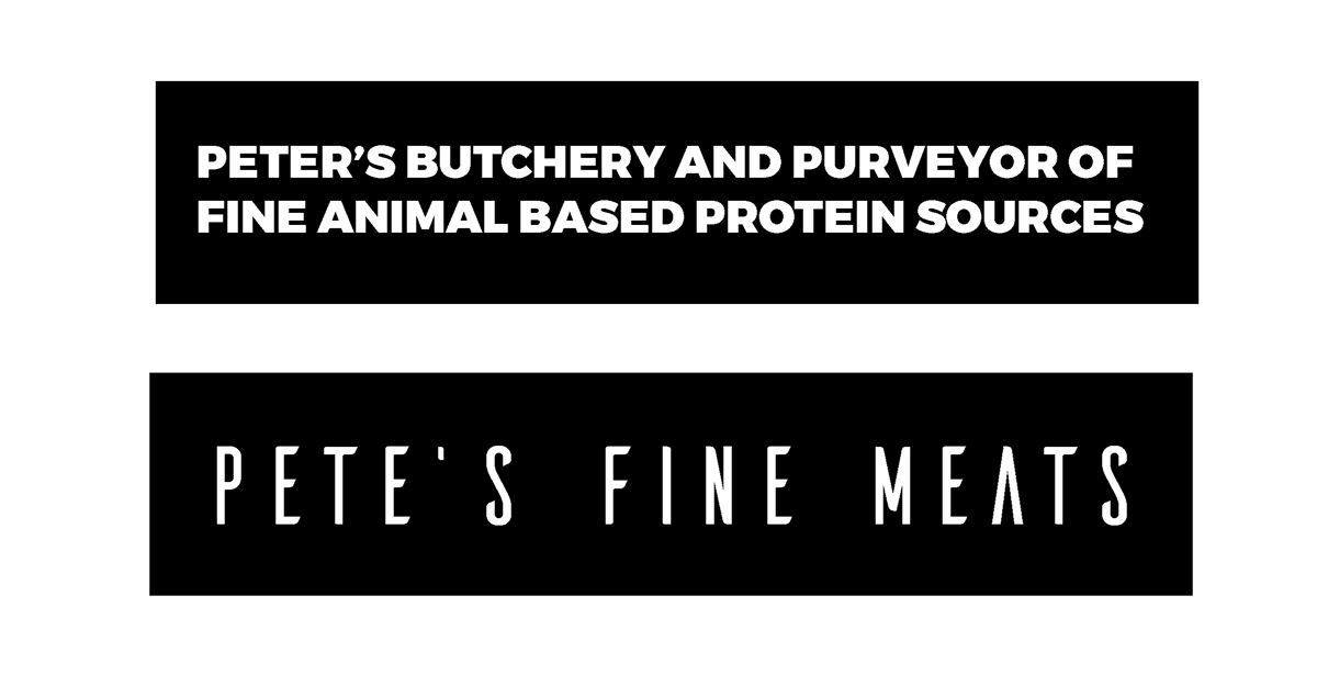
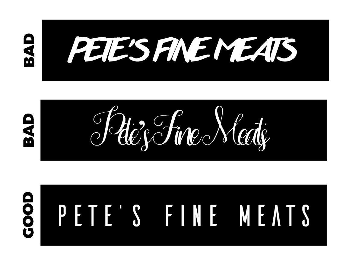
Is your logo easy to read and easy to recognize? Simply put, less words = more visual impact. Ever seen a 2 year old who points at those elusive golden arches and requests a Happy Meal? Peter’s Butchery and Purveyor of Fine Animal Based Protein Sources? How about Pete’s Fine Meats? It gets to the point and you can let everything else tell your brand story.
Once you’ve decided on a appropriate name, make sure that people can actually read it. Overly busy fonts and low contract can make your logo hard to read and if people can’t read it – they’ll never know who you are in the first place.
2. Colour, Colour, Colour
Colour – Picking an impactful colour is important, but be sure to check that your logo looks good in black & white, or greyscale too. Test it over different backgrounds – e.g. black font on a light background, coloured logo on a white background. Your logo will be used in many different situations some of which wont allow full colour, so ensure it looks good and is recognisable in black & white.
3. Size Does Matter
Size – Check your logo at different sizes, what looks good in full screen on your 32” MacBook may look terrible as a tiny logo on your Instagram profile. Try it big & small on various devices and resolutions.
![]()
It might also be a good idea to have a couple of different variations of your logo to suit these different situations. e.g Facebooks full “facebook” logo & their “f” logo
![]()
4. Does is look like a ….
The inappropriate test a.k.a does it look like a….? – When AirBNB infamously re-branded in 2014 the Internet noticed the striking resemblance, welll…something innappropriate. We’re surprised someone at AirBNB didn’t pick this up first. Check and check again and get an honest (and hopefully inappropriate) friend to check too.
This has happened way too many time – don’t believe me? Google “logo fail” and you’ll see what I mean.
Bonus Tip:
I’ve seen way too many entrepreneurs and small business hopefuls spend months agonising over minute details in their logos. If you’re hung up on your logo or any other branding decisions and have been for weeks or months. JUST. MAKE. A. DECISION! (sorry for yelling, hopefully you got the point though).
You’re wasting valuable time that could be spent bringing in more customers and $$$.
Hopefully these logo design tests will help you avoid some of the all too common branding mistakes. If you’ve got any of your own, let me know in the comments and I’ll try to add them to the article.